

Yukon TV

What is Yukon TV?
Yukon TV is a state-of-the-art streaming TV app from GCI that lets you watch live and on-demand from your phone, tablet, and a variety of streaming devices.
Yukon TV was launched by migrating existing GCI TV customers in Spring 2022. It’s now GCI’s priority to ensure this product is well showcased on the site so that new and existing customers will tune into the product, while also helping customers find the support that they need.
The Question?
How can we improve the Yukon TV experience for current customers looking for support, as well as prospective customers, while increasing the overall conversion?
Roles: UX Researcher
Methods: Directed Storytelling Interviews, Competitive Analysis, Low Fidelity Wireframing, UX audit, and Information Architecture Diagramming.
Tools: Zoom, Figma, Miro, Adobe Photoshop, Google Suite, Google Analytics, Content Square
Deliverables:
Findings and Recommendations Report
User Flows
Research
User flows
After reviewing the project brief, the focus shifted to identifying the current state of the user flows on the Yukon TV pages for both prospective and current customers. I was able to identify a handful of opportunities to help increase wayfinding, navigation, and communication for each flow.


Primary Focus: Plan Builder
The plan builder was selected as the most important user flow as it focused on converting prospective users into customers. A few painpoints in this flow included: Navigating out of the plan builder, a lack of feedback, and a lack of information.

New Customer: Plan Builder User
Secondary Focus: Support Pages
The Support pages are built to help retain current customers and help alleviate customer service calls, chats, and emails. A few pain points in this flow included: the overall navigation and a lack of organization within the pages.

Yukon Support Flow
Content and UX Audit
The Yukon TV pages were then audited by page on the following topics: content, copy, expectations, purpose, redundancies, consistency, components, organization, design, usability, feedback, accessibility, and hierarchy.

Support Page Content Comparision

Example of inconsistent plan components
Google Analytics Synthesis
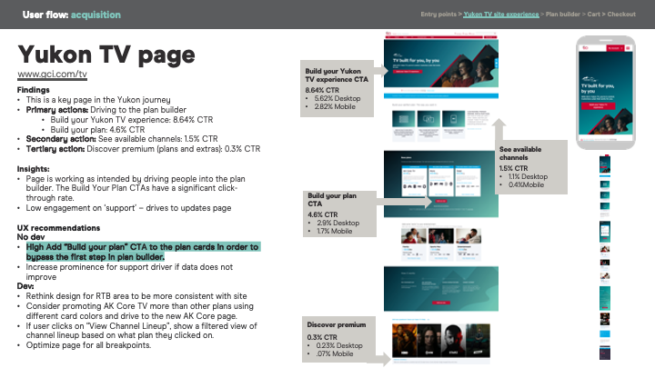
Finally, we collaborated with our analytics team to pull out some key information from Google Analytics to help understand what users were clicking on, what they were looking for, what pages were the most trafficked, how much time they spent on each page, and how they navigated the Yukon TV ecosystem. We also analyzed the plan builder individually to understand how the funneling and conversion process could be improved.
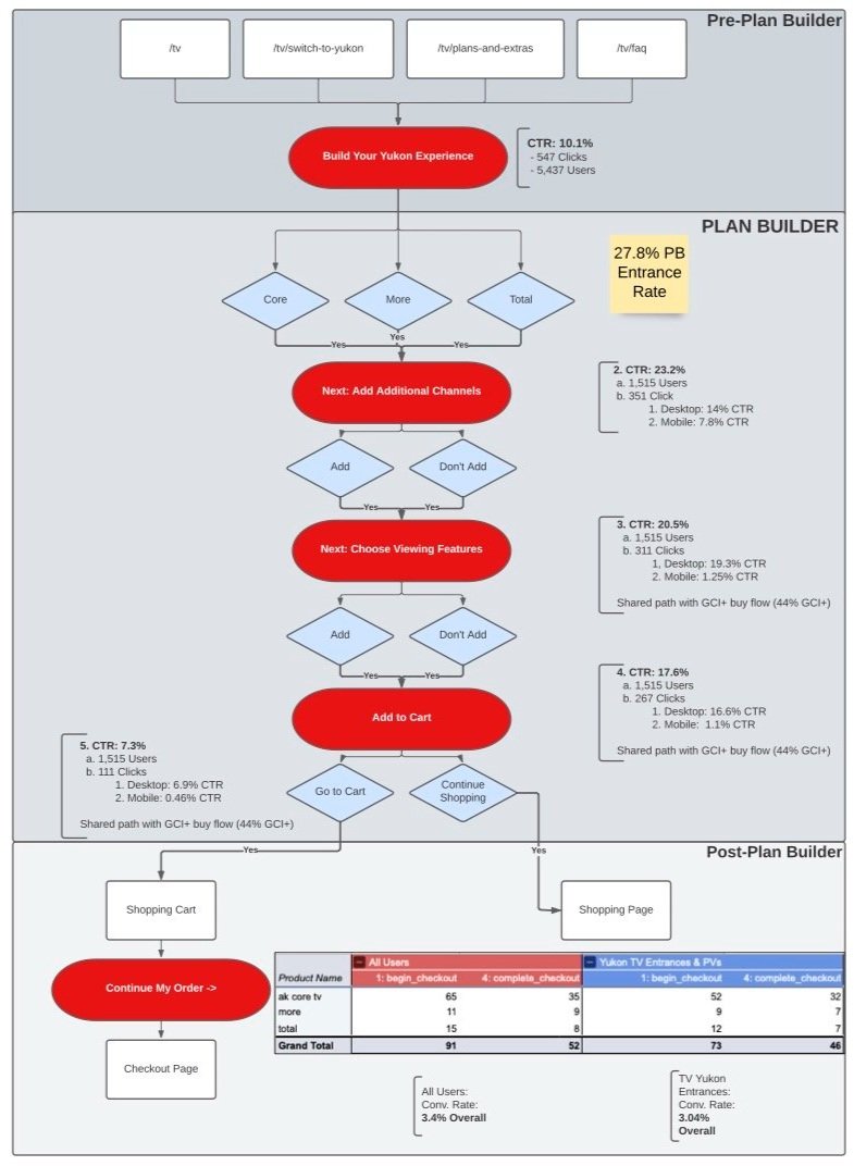
Plan Builder Conversion Analytics

Recommendations
Findings and Recommendations Report
After analyzing the content/ UX audit and Google Analytics, a variety of recommendations were crafted to improve the overall experience within Yukon TV.
The majority of the recommendations were focused on specific stages in the Yukon Experience: acquisition, plan builder and support.

Design
Page Description Diagrams
Based off the recommendations and client feedback, Page Description Diagrams (PDDs) were created for each page to outline the page hierarchy, content, and page elements. From here, the sections were organized into low, medium, and high priority.
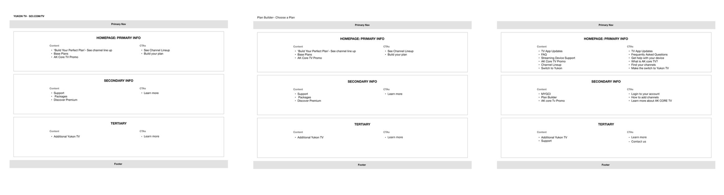
Sample PDD’s
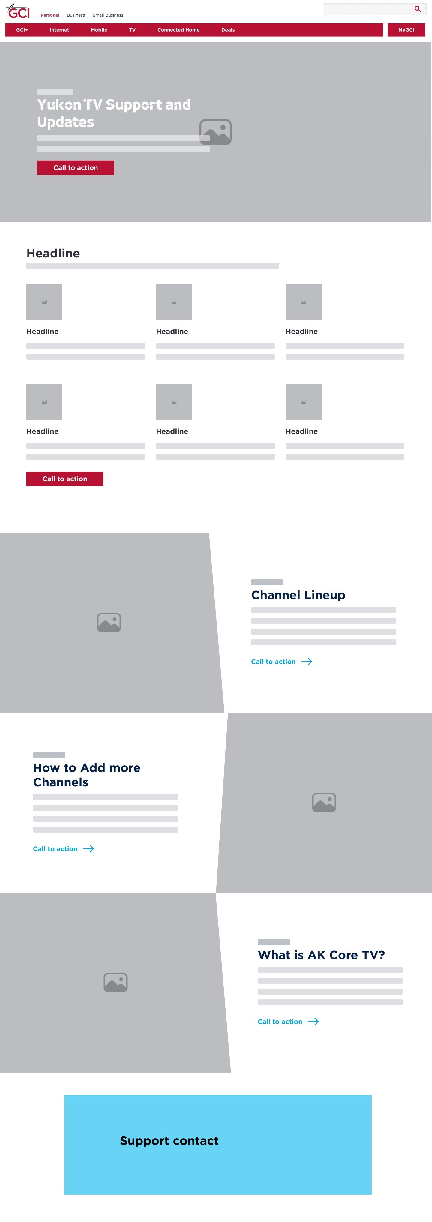
Wireframes
Based on the PDDs, wireframes were then created using the GCI-branded components. Each page was tailored to it’s specific audience. Key components included a Hero with a Primary CTA, a promotional banner with a secondary CTA for support, Plan product cards


Make it stand out
Whatever it is, the way you tell your story online can make all the difference.
Make it stand out
Whatever it is, the way you tell your story online can make all the difference.
Future Recommendations

BootUp

Gillette Children's Hospital- Usability Review

Code Championship